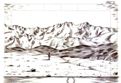
 Sometimes I do a tight sketch of a panel I'm not confident enough to draw from scratch. I use my normal inking brush and a Copic toner grey #3 to get an idea of how the grey tone will look in the finished page. It loosens me up to do the final image, but there often are aspects of the first drawing I like better.


5 comments:
Yeah, there are great aspects to both of these, but as good as the bottom one is, I like the top one better.
Love these two montain landscape.
They have something very pure flowing around..
The mountains are more assertive in the first sketch. I get nervous while drawing faces if I get one eye right and then the second eye can look kind of wobbly. Relaxing into it is hard.
I still think the first one looks better. The color and the grey tone complement the line quality maintaining the feel of the panel.
P.S.- Whats a Copic toner???
Copic is just the brand of brush pen, it's similar to a Prisma marker.
Post a Comment